My projects ▸ Providers
Challenge
Get people to file their taxes using a new tax filing product offered to debit card users.
Solution
Design an engaging lifecycle marketing campaign that makes the product accessible to users.
Impact
35% increase in new debit card users. Improved filing success rate by 17%. Helped users—40% hadn’t filed the prior year—get $40 million+ in refunds.
Providers is a mobile app that helps people manage their government benefits and banking needs in one place.
Built by Propel, a company that makes financial tools for people with low incomes, Providers started as a simple food stamp balance app. Now, it also has ways to earn income and save money on groceries, bills, and banking services with its debit card. Over 5 million U.S. families count on Providers.
As a content designer focused on growth initiatives, I helped ship new products and marketing campaigns that grew Providers’ user base, drove revenue, and enriched the user experience.
One of the impactful products we launched was Providers Tax, a free tax filing tool available to debit card users on the Providers app.
I led and executed the content for all lifecycle marketing emails and push notifications (over 60 pieces of content) to promote the product at every step of the user journey.
It was challenging, to say the least. Filing taxes is hard. Getting people to file their taxes is harder. To better understand these pain points, I did a lot of user research—especially on non-filers. I also dug deeper into our policy team’s competitive analysis to differentiate our product from tax prep services that prey on people with limited resources.
Winback Campaign Push Notification

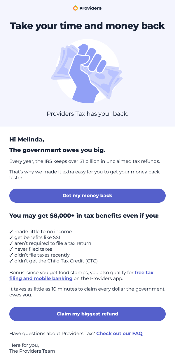
The most powerful insight I drew on was a study on how psychological ownership framing (e.g., “money that’s owed to you”) motivates people to apply for government benefits.
Pre-Launch Campaign Push Notification

Launch Campaign Email

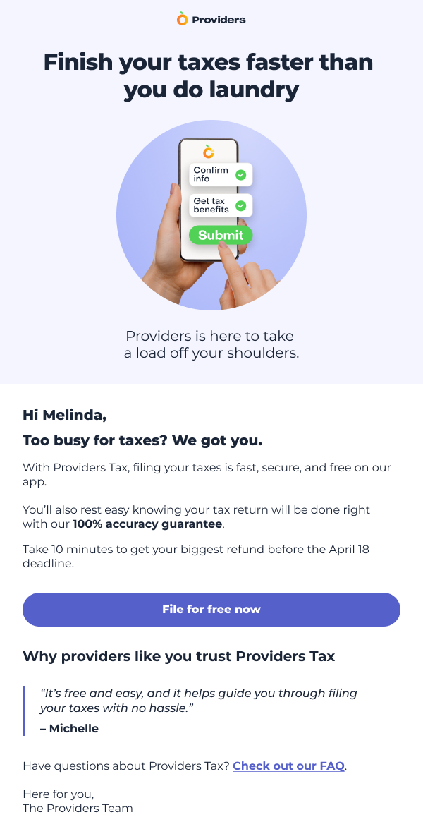
Another goal was to make our tax content both accessible and engaging. Like using relatable similes.
The following email header was partly inspired by our visual designer’s idea of making taxes seem so easy people could do it while waiting for the bus. And partly influenced by a cheesy movie line—a nod and a smile to our users, if you will.
Launch Campaign Email

I partnered closely with our growth lead to plan multivariate testing, and used the insights to iterate on and optimize our messaging for different audience segments and touchpoints. It was a taxing process, but we became rich with insights.
Our impact: the marketing campaign drove new debit card users by 35%, improved the tax filing success rate by 17%, and helped users get over $40 million in refunds. Notably, 40% of users hadn’t filed taxes the previous year.
At the heart of it, while hard to measure, I took part in elevating Providers’ brand tone of voice to build trust with users.
This was important to do. The government, banks, and tax services often use language that’s—intentionally or unintentionally—complicated and makes people feel ashamed to ask for help. Or, too hopeless to get the safety net services they’re entitled to.
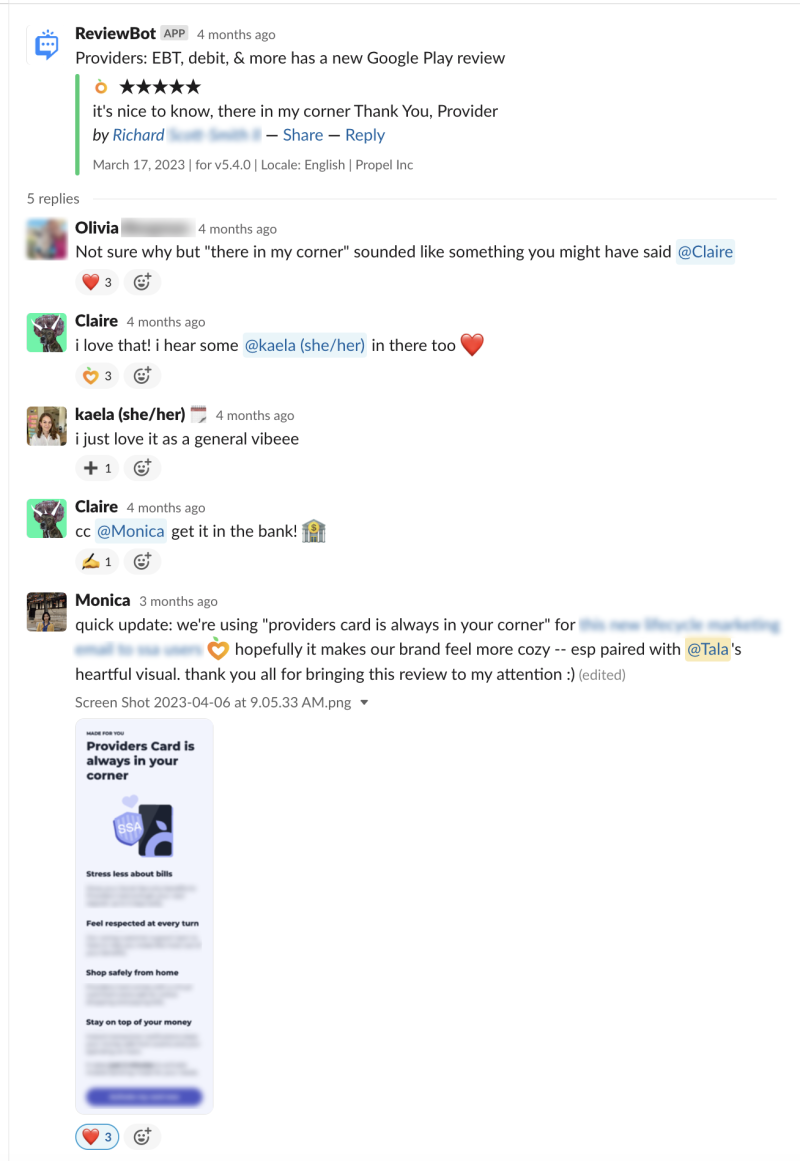
I’d often hang out on the social media channels where our audience frequents, listen in on user research calls, and peruse Providers’ app store reviews to analyze the language people used to talk about money and their everyday lives.
Beyond plain language, I used words familiar to our audience. Things like changing “your paycheck arrived” to “your paycheck hit” after learning that users often say “hit” to describe the joy of getting paid.
It was kind of like co-designing with users, as demonstrated in the following conversation. The goal? Talk with users, at eye level, like a trusted friend.

Slack thread shared with permission from all parties.
🌲 For in-product UX writing samples, send me an email.
Thanks to
The amazing team at Propel, the big-hearted design team, and my manager, Rose, who’d drop everything to mull over microcopy with me.
Special thanks to the Providers Tax team:
Alice DuCharme, data
Andrew Chien, engineering lead
Claire Harlam, design lead
Christina Callender, CX
Dave Sachs, growth lead
Embry Owen, in-product content
Heather Kester, CX
Jeff Bigg, engineering
Karla Hernandez, CX
Kate Rusk, CX lead
Khadija Hassanali, product
Mike Garris, debit ops
Olivia Bergman, product and policy lead
Tala Kernan, visual design
Plus, our kind partners at Column Tax.
← Explore all projects or ↑ Back to top
